| Author |
Message |
|
Eagle
Site Owner
Joined: Wed Sep 15, 2004 1:09 pm
Posts: 14631
Location: Pittsburgh

|
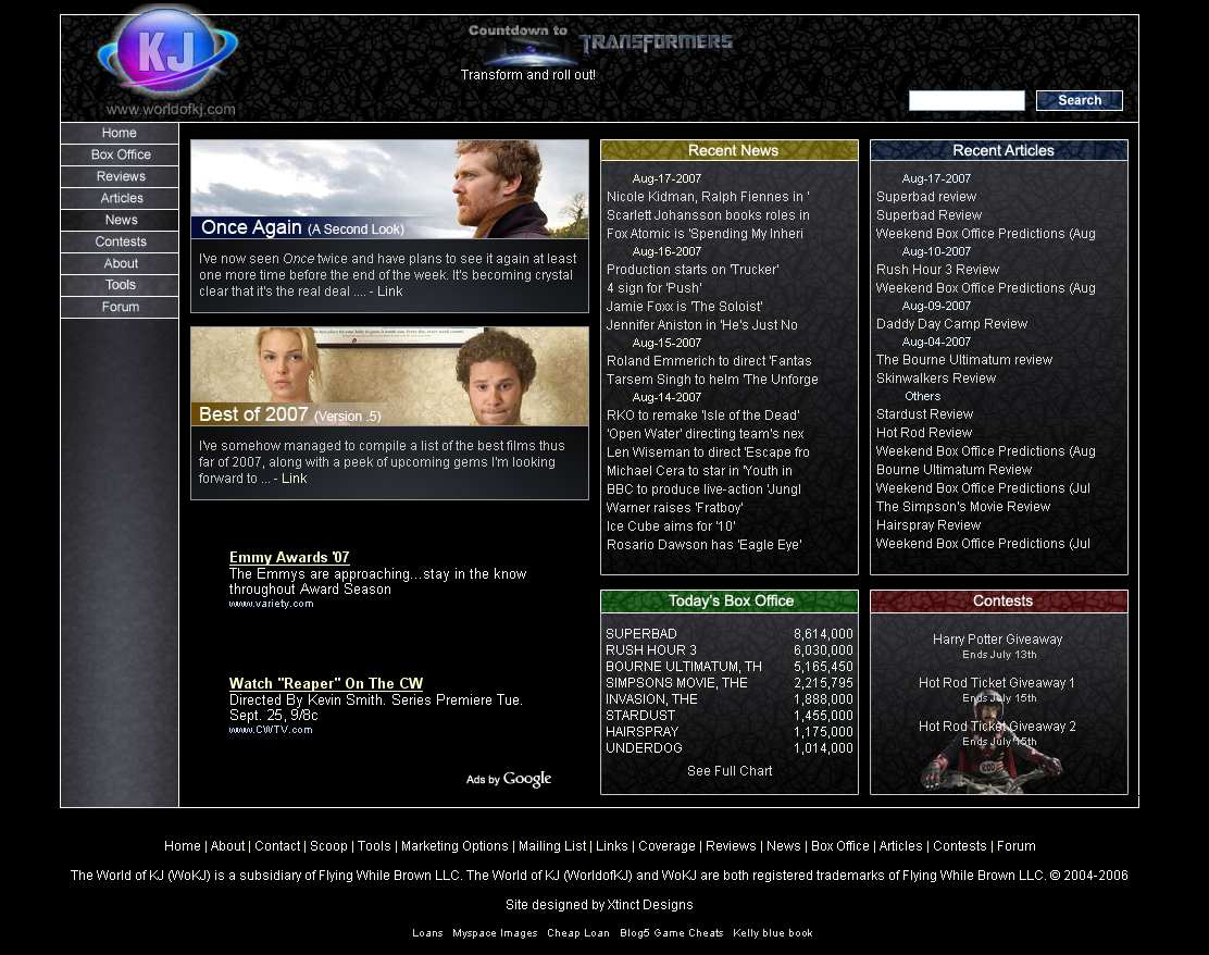
 Main Site Design - Opinions Please I am working on re-skinning the main site. I call it a re-skin rather than a re-design simply because the layout will remain the same, I am only changing the color. The reason for this is based on feedback I have received, right since the day I put the design into place, alerting me to the fact that white text is no fun to read. I personally like the black design, but I have received way to many opinions of a similar mold from way to many people not to take it into account. Therefore, I made the decision a little while back to move us to a white design. With the new forum in place, I am now making that my priority and hope to have it finished later this week. I realize some of you may be going  and thinking, "Hey, I liked the black!" You are not alone, but the simple fact is, long articles are a bit painful to read in white text/black background, and as a site, we can't have readers leaving or not finishing articles for this reason. So why the thread? What do you want from me?!I would like you to look at the new color design and let me know if there is anything you think should be changed. Not all changes and ideas will be used, but I will do my best to listen to everyone and incorporate as many as possible. You can feel free to suggest layout suggestions, but all I will do is log them for a later time. Right now, I am looking for opinions and suggestions on the color/theme/appearance of the site. I have also added a new 'favicon' for World of KJ. If you clear your cache and visit the site (new or old) you should see it if you use a tabbed browser next to the title of the page. If you don't mind, please don't use this thread to discuss the merits of black vs white text. That decision has been made, and I want this thread to be for suggestions related to changes with the new design.Fire away! Old Site: http://www.worldofkj.com" target="_blank New Design: http://www.worldofkj.com/index_new.php" target="_blank
Attachments:
 del2.JPG [ 601.11 KiB | Viewed 1885 times ]
File comment: New Site
 del.JPG [ 628.14 KiB | Viewed 1886 times ]
_________________
|
| Mon Aug 20, 2007 1:34 pm |
 
|
|
|
MARVEL_ROCKS
Forum General
Joined: Sun Mar 11, 2007 6:11 pm
Posts: 8202
|
Re: Main Site Design - Opinions Please I like the 1st one.
|
| Mon Aug 20, 2007 4:15 pm |
|
|
|
Chippy
KJ's Leading Pundit
Joined: Tue Oct 12, 2004 4:45 pm
Posts: 63026
Location: Tonight... YOU!
|
Re: Main Site Design - Opinions Please Muy Bueno.
_________________trixster wrote: shut the fuck up zwackerm, you're out of your fucking element trixster wrote: chippy is correct
|
| Mon Aug 20, 2007 4:48 pm |
|
|
|
Harry Warden
Orphan
Joined: Thu Jun 09, 2005 5:47 pm
Posts: 19747
|
Re: Main Site Design - Opinions Please What's odd is that in the current design, when I'm using a Mac the text is black on black, making it impossible to read without highlighting it (thus turning it white with a blue highlight background). On my PC, it's fine though. I wonder why that is?
|
| Mon Aug 20, 2007 4:56 pm |
|
|
|
trixster
loyalfromlondon
Joined: Wed Oct 13, 2004 6:31 pm
Posts: 19697
Location: ville-marie
|
Re: Main Site Design - Opinions Please I definitely like the new, white one better. Fits with the forum theme I have going.
_________________Magic Mike wrote: zwackerm wrote: If John Wick 2 even makes 30 million I will eat 1,000 shoes. Same. Algren wrote: I don't think. I predict. 
|
| Mon Aug 20, 2007 6:19 pm |
|
|
|
Eagle
Site Owner
Joined: Wed Sep 15, 2004 1:09 pm
Posts: 14631
Location: Pittsburgh
|
Re: Main Site Design - Opinions Please Joe wrote: What's odd is that in the current design, when I'm using a Mac the text is black on black, making it impossible to read without highlighting it (thus turning it white with a blue highlight background). On my PC, it's fine though. I wonder why that is? I'm not really sure, it could be a browser issue, but I'm not entirely sure. Does anyone see anything they would like changed about the new, white, version? _________________
|
| Mon Aug 20, 2007 6:38 pm |
|
|
|
Zep
Angels & Demons
Joined: Thu Apr 26, 2007 9:49 pm
Posts: 273
Location: Behind the portables.
|
Re: Main Site Design - Opinions Please I like the new one simply because it matches the forum theme. That is something very important in my opinion.
_________________
|
| Mon Aug 20, 2007 7:02 pm |
|
|
|
Harry Warden
Orphan
Joined: Thu Jun 09, 2005 5:47 pm
Posts: 19747
|
Re: Main Site Design - Opinions Please Eagle wrote: Joe wrote: What's odd is that in the current design, when I'm using a Mac the text is black on black, making it impossible to read without highlighting it (thus turning it white with a blue highlight background). On my PC, it's fine though. I wonder why that is? I'm not really sure, it could be a browser issue, but I'm not entirely sure. Does anyone see anything they would like changed about the new, white, version? On a Mac, I use Safari.
|
| Mon Aug 20, 2007 7:11 pm |
|
|
|
jujubee
Forum General
Joined: Wed Feb 08, 2006 11:45 pm
Posts: 6447
|
Re: Main Site Design - Opinions Please Joe wrote: Eagle wrote: Joe wrote: What's odd is that in the current design, when I'm using a Mac the text is black on black, making it impossible to read without highlighting it (thus turning it white with a blue highlight background). On my PC, it's fine though. I wonder why that is? I'm not really sure, it could be a browser issue, but I'm not entirely sure. Does anyone see anything they would like changed about the new, white, version? On a Mac, I use Safari. Looks fine to me. Could you have your preferences set weird? Or are you using the 3.0 beta?
_________________
......
|
| Mon Aug 20, 2007 7:18 pm |
|
|
|
Viper Rodgers
Leader of the Pack
Joined: Wed Aug 02, 2006 3:35 am
Posts: 1526
Location: A better place
|
Re: Main Site Design - Opinions Please Yah, matching the site with the forum will make it seem all as one instead of being the "World of KJ Site" and the "World of KJ Forum", it will more consistent! So yes, go with the white. 
|
| Mon Aug 20, 2007 7:50 pm |
|
|
|
Jmart
Superman: The Movie
Joined: Fri Oct 22, 2004 8:47 am
Posts: 21230
Location: Massachusetts
|
Re: Main Site Design - Opinions Please The new coloring looks great. As for the layout though, will it eventually be changed so the full article titles aren't cramped or offscreen. That's my only complaint about the new and old look. Other than that, it looks fantastic.
_________________My DVD Collection
Marty McGee (1989-2005)
If I’m not here, I’m on Letterboxd.
|
| Mon Aug 20, 2007 8:26 pm |
|
|
|
insomniacdude
I just lost the game
Joined: Wed Oct 13, 2004 7:00 pm
Posts: 5868
|
Re: Main Site Design - Opinions Please RonBurgundy wrote: Yah, matching the site with the forum will make it seem all as one instead of being the "World of KJ Site" and the "World of KJ Forum", it will more consistent! So yes, go with the white. I'm on one of the darker skins for the forum. That would do jsut the opposite for me. Personally I prefer a black backround. You have ay idea what looking ata bright white backround does for your eyes? Here's an idea: go look at a lightbulb. That might give you a hint. _________________
|
| Mon Aug 20, 2007 9:30 pm |
|
|
|
Viper Rodgers
Leader of the Pack
Joined: Wed Aug 02, 2006 3:35 am
Posts: 1526
Location: A better place
|
Re: Main Site Design - Opinions Please insomniacdude wrote: RonBurgundy wrote: Yah, matching the site with the forum will make it seem all as one instead of being the "World of KJ Site" and the "World of KJ Forum", it will more consistent! So yes, go with the white. I'm on one of the darker skins for the forum. That would do jsut the opposite for me. Personally I prefer a black backround. You have ay idea what looking ata bright white backround does for your eyes? Here's an idea: go look at a lightbulb. That might give you a hint. Eh, us forum dwellers that are on here every day can handle it! Even if we do look like this after awhile..... 
|
| Mon Aug 20, 2007 9:49 pm |
|
|
|
Eagle
Site Owner
Joined: Wed Sep 15, 2004 1:09 pm
Posts: 14631
Location: Pittsburgh
|
Re: Main Site Design - Opinions Please Less than 15 people are on a dark background, while over 9000 + guests are on a white, so the vast majority are on white.
Regardless, like I said, the decision is made, I just want to know if there was anything you guys think could be improved on the new design. A color changed, a edge circular instead of square, etc.
_________________
|
| Mon Aug 20, 2007 10:22 pm |
|
|
|
Bradley Witherberry
Extraordinary
Joined: Sat Oct 30, 2004 1:13 pm
Posts: 15197
Location: Planet Xatar
|
Re: Main Site Design - Opinions Please Not exactly on topic - - but I miss the "Mark Topics Read" feature on the main "Board Index" page - - now you've got to go to each forum separately to do this...
|
| Tue Aug 21, 2007 6:09 am |
|
|
|
jujubee
Forum General
Joined: Wed Feb 08, 2006 11:45 pm
Posts: 6447
|
Re: Main Site Design - Opinions Please Bradley Witherberry wrote: Not exactly on topic - - but I miss the "Mark Topics Read" feature on the main "Board Index" page - - now you've got to go to each forum separately to do this... That's why I use SubSilver instead of Serenity.
_________________
......
|
| Tue Aug 21, 2007 6:10 am |
|
|
|
Bradley Witherberry
Extraordinary
Joined: Sat Oct 30, 2004 1:13 pm
Posts: 15197
Location: Planet Xatar
|
Re: Main Site Design - Opinions Please jujubee wrote: Bradley Witherberry wrote: Not exactly on topic - - but I miss the "Mark Topics Read" feature on the main "Board Index" page - - now you've got to go to each forum separately to do this... That's why I use SubSilver instead of Serenity. Thanx for the tip, jujubee! I've now switched over to SubSilver and it's actually more readable - - I'd tried a couple of the other skins at first and found them frightening...
|
| Tue Aug 21, 2007 6:26 am |
|
|
|
Eagle
Site Owner
Joined: Wed Sep 15, 2004 1:09 pm
Posts: 14631
Location: Pittsburgh
|
Re: Main Site Design - Opinions Please Bradley Witherberry wrote: jujubee wrote: Bradley Witherberry wrote: Not exactly on topic - - but I miss the "Mark Topics Read" feature on the main "Board Index" page - - now you've got to go to each forum separately to do this... That's why I use SubSilver instead of Serenity. Thanx for the tip, jujubee! I've now switched over to SubSilver and it's actually more readable - - I'd tried a couple of the other skins at first and found them frightening... There is still a feature to mark all the forums read on the board index, it is at the bottom of the last forum. _________________
|
| Tue Aug 21, 2007 9:42 am |
|
|
|
xiayun
Extraordinary
Joined: Tue Oct 12, 2004 3:41 pm
Posts: 25109
Location: San Mateo, CA
|
Re: Main Site Design - Opinions Please Yeah, I like consistency with the new one too.
Could we reduce the height of Google ads?
_________________Recent watched movies: American Hustle - B+ Inside Llewyn Davis - B Before Midnight - A 12 Years a Slave - A- The Hunger Games: Catching Fire - A- My thoughts on box office
|
| Tue Aug 21, 2007 3:24 pm |
|
|
|
Gulli
Jordan Mugen-Honda
Joined: Mon May 01, 2006 9:53 am
Posts: 13403
|
Re: Main Site Design - Opinions Please Love the colour change Karl.
_________________
Rosberg was reminded of the fuel regulations by his wheel's ceasing to turn. The hollow noise from the fuel tank and needle reading zero had failed to convay this message
|
| Tue Aug 21, 2007 3:27 pm |
|
|
|
paper
Artie the One-Man Party
Joined: Sat Sep 17, 2005 2:53 pm
Posts: 4632
|
Re: Main Site Design - Opinions Please I still feel all the recent news and reviews are so bunched together they seem very unimportant and uninteresting. And I can't put my finger on it, but the page somewhat reminds me of those websites where you'd miss one letter from a real website and it'd lead you to some sketchy website...like typing in fandago.com instead of fandango for instance. Like it doesn't have that original, branded feel to it. The main title is just too generic looking.
EDIT: I think the font (of just about everything) needs to be changed to a more unconventional one as well. That could part of what makes it look so plain.
Just my opinions, don't take this as me bashing anyone's work or expecting all these changes to be made, just my honest take on it.
|
| Tue Aug 21, 2007 4:06 pm |
|
|
|
Jailbird
Nancy Boy
Joined: Sun Aug 05, 2007 2:50 pm
Posts: 182
Location: Behind your back stickin a pickle up your ***Stars**
|
Re: Main Site Design - Opinions Please white gives space....white is professional...i know this because i prefer black.
that is all.
_________________
I am at the brink of sanity !!!
Between extreme intelligence !!!
And split personalities !!!
But i elevate to the point of reversing gravity !!!
Revolutionary conceptuality spitting out of me !!!
Even the dead people in my family tell me !!!
They are proud of me !!!
|
| Wed Aug 22, 2007 10:58 am |
|
|
|
Jailbird
Nancy Boy
Joined: Sun Aug 05, 2007 2:50 pm
Posts: 182
Location: Behind your back stickin a pickle up your ***Stars**
|
Re: Main Site Design - Opinions Please still your site is pwning....its much better than BOM....who are you ? is this site a fan site or what ? does it have the status of BOM ? are you in the ranks of brandon gray ? or you're just a fan ?
what does this kj thing stand for ?
i think you should also think about changing the domain name ....worldofkj is lame...not very lame but you can fish a better one....
we can share ideas about the name and vote and stuff...its not gonna cost you alot...go ahead and kick it off...5000 registered users is a small number....
_________________
I am at the brink of sanity !!!
Between extreme intelligence !!!
And split personalities !!!
But i elevate to the point of reversing gravity !!!
Revolutionary conceptuality spitting out of me !!!
Even the dead people in my family tell me !!!
They are proud of me !!!
|
| Wed Aug 22, 2007 11:03 am |
|
|